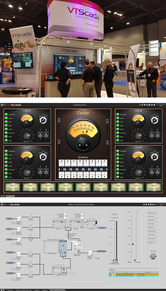
The story of an HMI display that stops folks in the aisle.
This is the VTScada booth where we demonstrate our monitoring and control software at national water and wastewater exhibitions like WEFTEC and AWWA ACE. Looking like a two-story spaceship, our booth houses a fully-functional SCADA system that includes five redundant operator/developer workstations and a variety of mobile devices. As shiny and futuristic as it all looks, what really grabs people’s attention is the SCADA display we are looking at on the big monitor. We call it Dashboard A. In a crowded noisy exhibit hall, it literally stops folks in the aisle. After a moment of staring, some will even storm off and drag back one of their coworkers to stare at it with them. Invariably, they venture onto our padded carpet for a closer look. Then, they say one of two things, “I love it,” or “I hate it.”
High Performance – Those who hate it believe SCADA displays should be simple and greyscale and only come to life when the process begins to go wrong. This design philosophy, known as High Performance HMI™, began in the oil and gas sector but is gaining popularity in a variety of industries including power generation and water and wastewater. This methodology represents one way to manage complexity and increase situational awareness in large applications. As process values stray form configured setpoints into active alarm conditions, color, animation, and sound begin to draw attention to the problem area. The third screen on the right employs many high performance design principals. As popular as this idea has become, this screen drives almost no traffic into the booth.
High Impact – Those who love Dashboard A tell us about the messy primitive-looking displays they use every day. Since few SCADA project bids specifically allocate money to make displays attractive, many end users are left with applications that are hard to look at and frustrating to use. Since we developed Dashboard A exclusively for the tradeshow industry, it is not an ideal example of an industrial interface. However, booth visitors have no trouble imagining how they would put these high-resolution elements to use. They admire the photo-real gauges that display scaling at a glance. They like the shading and lighting effects that fame groups of related objects and focus the user’s attention. As far as I know, there is no industry term for this approach but we call it “High Impact”.
Something for Everyone – Regardless of their preference for SCADA graphics, I tell people that the most important take away from these displays is that they were created entirely from out-of-the-box images, shapes, and widgets using intuitive drag-and-drop tools. I open the VTScada Idea Studio and begin moving the pieces around and dragging in new elements from folders on the left. Visitors often notice, before I point it out, that the Idea Studio uses a context-sensitive ribbon across the top that is familiar to anyone who has used Microsoft Office® products like PowerPoint® or Word®.
Build Your Own Displays – This means that, with little training, users can begin creating their own custom screens based on their chosen methodology. Simple selection and alignment tools mean no more sloppy looking screens. Those that like high impact displays can choose from a wide variety of photo-real gauges, indicators, switches, controls, and industry-specific equipment. They can easily create rich backgrounds and organize them with frames and lighting effects. Style tags allow you to create consistent color conventions so you can easily change the look and feel of your entire application in one place. High performance fans can construct their pages using greyscale equipment widgets that can change their color, size, position and opacity based on process and alarm information. Embedded custom trends can include multiple color-coded I/O plots or singular monochrome spark lines.
Which should you choose? – In 2015, the International Standards Association (ISA) released ISA-101-2015, Human Machine Interfaces for Process Automation and Control. (https://www.isa.org/intech/2020/september-october/isa-101-01-human-machine-interfaces-for-process-au) This standard describes in detail best practices for HMI display design to improve situational awareness and emergency reaction time. We recommend you review this as part of your design process to determine which approach best suits your process needs.
Visit our spaceship! – See Dashboard A and a wide variety of real world displays at our booth at WEFTEC 2017 in Chicago. We will give you a guided tour of the VTScada Idea Studio and all our instantly intuitive configuration tools. Whether Dashboard A makes you smile or frown, we think you will agree that it certainly stops folks in the aisle.
High Performance HMI is a trademark of Plant Automation Services, Inc. PowerPoint, Word, and Office are trademarks of Microsoft.
About the Author
Christopher Little, Sales and Marketing, Trihedral – For over ten years Chris has been producing articles, case studies, and videos covering topics related to industrial monitoring and control. His work has been featured in a variety of industry-specific publications.
