Arc Meter Widget
* Can use properties from a Style Settings tag.
The Arc widget represents the associated tag's value as portion of an arc. The darker portion of the arc starts at the angle you specify, where vertical (North) is zero degrees. Increasing values are indicated by the darker portion sweeping in a clockwise direction. The colors are set by the LED (analog) values of a selected Style Settings tag, and values above the linked tag's alarm setpoint can be indicated.

Four variations on a theme, showing the control you have over arc configuration.
These widgets will indicate an active alarm according to the properties of the attached Style Settings tag (Exceptions tab). To continue indicating an alarm that is unacknowledged but no longer active, change the property AlarmWidgetsShowUnackedNormalAlarm in the application's properties, setting the value to 1.
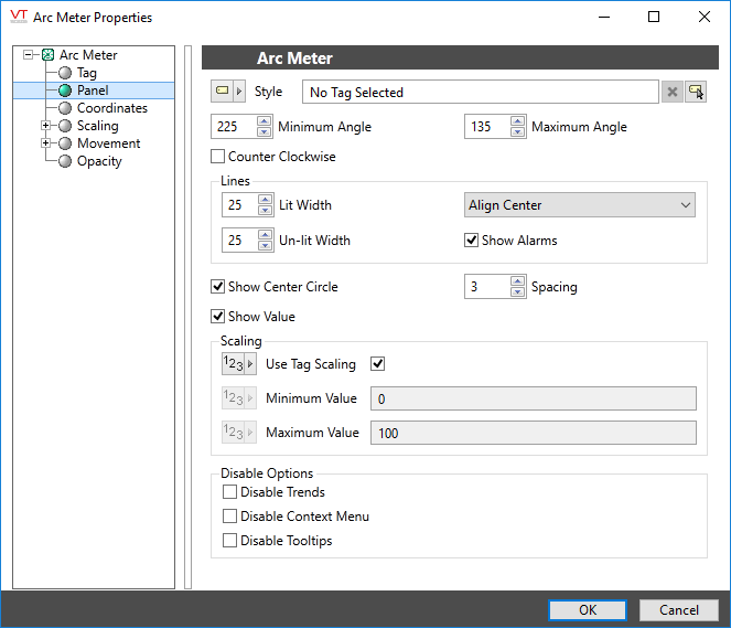
The properties dialog for the Arc widget:

Tag
The Tag field displays the name and description of the tag that is associated with this widget. You can use this to select a different tag or parameter to use as the data source for this widget.
Style
Optionally, select Style Settings Tags to control the colors shown by the light, in response to the linked tag's value and alarm state.
Minimum Angle & Maximum Angle
Sets the starting point and the ending point for the sweep of the arc. Defaults to 270 degrees for the start angle and 90 degrees for the end angle. The angle is measured in degrees, and increases in the clockwise direction.
Example (b) shows an arc with minimum angle zero and maximum angle of 180 degrees.
Lines
Use to adjust the width of the unlit (background) and lit (foreground) portion of the arc.
Example (c) shows an arc with an unlit width of 18 pixels and a lit width of 8 pixels. The alignment is Center. Alignment applies only when the lit and unlit widths are of differing values, giving you the option of aligning the lit portion against the outside edge, inside edge, or centered within the unlit portion.
Show Alarms
If selected, the arc will indicate when the associated tag is in an active alarm state by using the alarm indication settings as configured in the associated Style Settings tag. Only that portion of the sweep above or below the alarm setpoint will use the alarm indication.
This option is in use for all four of the example images.
Counter Clockwise
If selected, sections of the arc will sweep (increase) in a counter-clockwise direction rather than the standard clockwise.
Show Center Circle & Spacing
These two properties should be used together. The center circle will be displayed using the unlit color of the arc. The spacing controls the size of the circle by setting the number of pixels from the unlit ring of the arc to the perimeter of the circle.
Example (c) shows a center circle in addition to showing lines with varying widths.
Show Value
If selected, the arc will display the current value of the linked tag. Units are not shown.The color will always match that of the lit portion of the arc.If a center circle is shown, then the value will be superimposed on the circle.
Scaling
If Use Tag Scaling is selected, the minimum and maximum range of the meter will be controlled by the tag's scaled minimum and maximum values.
Otherwise, you can override those values to set your own scale range. For example, assume that you have a tag for which the minimum and maximum scaled process values are 20 and 80 respectively. Drawing this tag with a minimum value of 0 and a maximum value of 100 will result in a meter that shows a full range of numbers from 0 to 100, but whose needle will move only between 20 and 80.
Disable Options
Disable selected operator-interaction features of this widget.
See: Operator Interaction Controls
Gauges\
