Choices for Operator Interaction
Tag widgets can provide the following features for operators: a trend window in response to a left-click, a pop-up menu in response to a right-click, a tooltip in response to the pointer hovering over the widget. Availability varies by widget, linked tag type, and your configuration choices.
For widgets linked to numeric types, a left-click on the widget will cause the Historical Data Viewer (trend) window to open for the associated tag. If the click lands on several overlapping widgets, all the associated tags will be plotted in the HDV. You can disable this feature for all analog tags by setting AITrendEnable to false (0) and for all digital tags by setting DITrendEnable to false.
Context menu

In all cases, a right-click on the widget will cause a context menu to open. The contents of this menu will vary by tag type - the image shown here is a sample. The attached tag in this case is an I/O & Calculations Tag.
In all cases, there will be a Help option at the top, opening the relevant page in this reference for the associated type. A Properties option will be found at the bottom of the menu, allowing authorized users to re- configure the attached tag.
Tooltip

Hovering the pointer over any tag’s widget will cause a tool tip to display. This enables the operator to see the tag’s name and description. You can disable this feature globally by setting the application property ShowTip to false.
Confirmation Dialog (Only in selected output widgets)
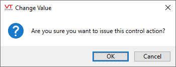
If selected, the operator must confirm the action before a control signal is sent to the PLC. An example of the confirmation dialog follows:

(Text will vary according to your configuration.)
Disable Control (Only in selected output widgets)
When selected, operators will not be able to use this widget to write a value via the linked tag. It is possible to create an expression that will check the identity or privilege set of the current operator before enabling this option. See the examples at the end of Examples of Expressions.
Widgets configured with Disable Control selected are "grayed-out" if displaying a label. Widgets that display an image become semi-transparent according to the property, DisabledControlWidgetOpacity.
This option affects only the widget being configured. If a second control widget is linked to the same tag and neither the tag or that second widget are protected, the operator will be able to write to hardware.
These tools are configured on an individual basis using each widget's properties dialog. There is no global setting for all. Options will vary by widget as appropriate. For example, there is no need of a confirmation dialog in a widget that does not provide operator control. Note also that selected widgets that provide output control have more options to configure these interaction controls than the basic check box.

Used by most input widgets |

Used by some control widgets |

Used by selected control widgets |
These options are stored as parameters to the widget. This means that you can right-click to edit the widget's Menu Item tag in the Widgets palette to set defaults for these parameters. Note that any given widget may have more than one entry in the palette. A change to one Menu Item will not affect any other.

Right-click the palette entry to open the properties dialog.
