Used by: I/O and Calculations, Analog Input, Analog Status, Analog Output, Analog Control, Digital Input, Digital Status, Digital Output, Digital Control, MultiWrite, Pump Status, Selector Switch, Trigger.
* Does not use the Style Settings tag.
The Push Button widget provides a method for operators to issue control actions, via the linked tag. The widget's configuration holds the value that will be written to the linked tag when the button is clicked.

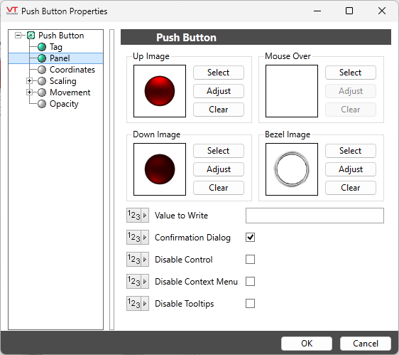
The properties dialog for the Push Button widget:

Configuration options for a Push Button widget
Value to Write
Set the value that will be written when the completed object is clicked. If the associated tag is an analog or digital output, this may be any value that is legal for that tag. Otherwise, this value should match one of the configured states for the associated selector switch.
If this value is not set, the button will not work.
Up Image
The image that will be shown when the button is not being clicked.
Image Select
Opens the Select Image dialog, within which you can browse for images, import new images, and select the image to use.
* VTScada recognizes the following image formats: .BMP, .CUT, .PCX, .EMF, .WMF, .JPG, .PNG, .TIF
Image Adjust
Opens the Adjust Image dialog box, which can be used to change the color and other display characteristics of the image. See: Adjust Image Dialog
Image Clear
Remove the selected image and do not select a replacement.
Down Image
The image that will be shown when the button is being clicked.
Mouse Over
The image that will be shown when the cursor is over the image.
Bezel Image
An image that should be scaled to surround the button, so that it does not appear to be floating above a panel.
Options
Confirmation Dialog / Disable Control / Disable Context Menu / Disable Tooltips.
Refer to Operator Interaction Controls for a full description of these standard widget options.
Buttons & Switches\
Basic Components\Button Controls\
