Toggle Button Widget
Used by: I/O and Calculations tag, Digital Status tag
* Can use properties from a Style Settings tag.
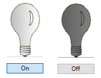
The Toggle Button widget is used to display an up / down toggle button, providing digital control and feedback.

When the toggle is pressed (or "down") it has a blue highlight and displays the "down" label. When "up", it does not have the blue highlight.
You control whether the signal sent for pressed / down is a zero or a one. The signal sent for "up" will be the opposite.
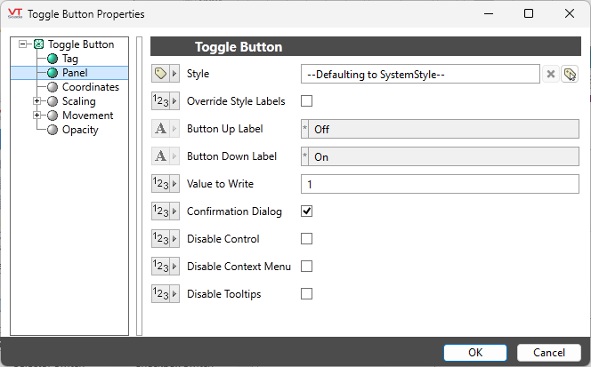
The properties dialog for the Toggle Button object:

Style
Link to the appropriate Style Settings tag. Defaults to the System Style.
Override Style Labels
If selected, the following two options will be enabled. Otherwise, the labels will match those defined for a digital tag or the matching equipment type.
Button Up Label
Enabled only when Override Style Labels is selected. Sets the label to display in the "up" position.
Button Down Label
Enabled only when Override Style Labels is selected. Sets the label to display in the "down" position.
Value to write
The default is to write a 1 when the button is pressed and in the "down" position.
The only alternative is to write a 0 when the button is pressed, meaning that 1 will be written on the following press when the button returns to the "up" position.
Options
Confirmation Dialog / Disable Control / Disable Context Menu / Disable Tooltips.
Refer to Operator Interaction Controls for a full description of these standard widget options.
Button & Switches \ Basic Controls
