Service Status Widget
Used by: Not linked to any tag
* Does not use the Style Settings tag.
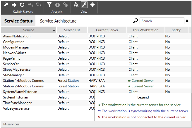
The Service Status widget duplicates the content of the Services Page on a page of your choice within your application. Note that your page must be protected by a custom security privilege that you create. The Service Page Access privilege will not restrict who can view this widget on your page.
Refer to the Services Page for a detailed description of the features of the Service Status widget.

Service Status including the optional legend
The properties dialog for the Service Status dialog:

Starting List
Preset the list to be displayed or show the list the operator was last viewing.
Options include: Service Status, Service Architecture, or Last Selected (the default).
Text Size
Adjusts the relative size of the font used in the lists.
Options include Small, Medium, Large, or Last Selected (the default).
Background
Sets the background color of the lists. Defaults to white with gray banding.
Text Color
Sets the color used for text within the lists. Defaults to black.
Filter
Sets a filter that will limit which services are shown in the list. Filtering
Show Toolbar
Controls whether the toolbar (and therefore access to the various tools) is available to operators.
Show List Selection
If selected, operators can select between the Service Status or the Service Architecture list.
Show Search Field
If selected, operators can search for services by name
Show Active Filters
If selected, operators can not only see the active filters but can also remove them.
Show Status Bar
The status bar is at the bottom of the widget, showing the number of services in the filtered list.
Show Border
Controls whether the widget is bounded by a single-line border.
Use Theme Color in Toolbar
If not selected, the toolbar will be shown using the default gray theme.
Disable Options
Disable selected operator-interaction features of this widget.
See: Operator Interaction Controls
Analytics\Diagnostics
Analytics\Statistics
Tools\System Status Tools
