* Does not use the Style Settings tag.
The Page Hotbox widget is a navigational tool, used to create a connection from one page to another.
The hotbox is invisible unless the pointer is over it, at which time it turns yellow (or any other configured color). It is common to place a hotbox around a text label or an image so that operators will know where to find it, and what page to expect when they click.

Note that there is a choice of behavior in one uncommon configuration:
A page button or page hotbox drawn on a windowed (pop-up) page, and that widget calls the same page. You might create this configuration if you have a parameterized page and want to switch parameter values while staying within the pop-up. In this configuration, you can use the PageChangeUpdateSamePopup parameter to control whether another instance of the page is created, or the current page is replaced.
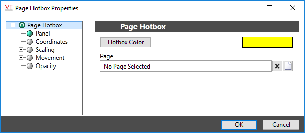
The properties dialog for the Page Hotbox widget:

Hotbox Color
While most developers will leave the default color in place for the sake of consistency, you might decide to color-code the hotboxes for various groups of pages in your application. You might also want to ensure that Page Hotboxes use a different color than Legacy Set Value Hotboxes, which are analog control widgets.
Page Name
Select the page to be opened when the operator clicks the hotbox. The Page Menu Page can be selected, as can pages of subordinate applications, if any.
Parameters
Visible only if the selected page has parameters. If so, it is important to select the tags and values that will be used for those parameters when the operator opens the page using this particular hotbox. Failing to do so will result in the operator being prompted for parameter values with every return visit.
Whether the page opens as a pop-up window or full screen, depends on the configuration of the page, and not on any configuration of the hotbox.
Page Navigation\
Tools\Standard Library\
