Standard Library. Not linked to any tag.
* Does not use the Style Settings tag.
The Page Button widget is a navigational tool, used to create a connection from one page to another.
Buttons are always visible, and can be configured with their own label so that operators will know what to expect when they click.

Note that there is a choice of behavior in one uncommon configuration:
A page button or page hotbox drawn on a windowed (pop-up) page, and that widget calls the same page. You might create this configuration if you have a parameterized page and want to switch parameter values while staying within the pop-up. In this configuration, you can use the PageChangeUpdateSamePopup parameter to control whether another instance of the page is created, or the current page is replaced.
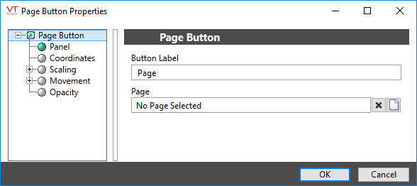
The properties dialog for the Page button widget:

Button Label
The label should always tell the operator what to expect to happen when they click the button.
If the label is to include an ampersand (&), enter two ampersands (&&).
Page Name
Select the page to be opened when the operator clicks the button. The Page Menu Page can be selected, as can pages of subordinate applications, if any.
Parameters
Visible only if the selected page has parameters. If so, it is important to select the tags and values that will be used for those parameters when the operator opens the page using this particular button. Failing to do so will result in the operator being prompted for parameter values with every return visit.
Whether the page opens as a pop-up window or full screen, depends on the configuration of the page, and not on any configuration of the button.
Page Navigation\
Tools\Standard Library\
