* Does not use the Style Settings tag.
The Edit Property widget is used to allow operators to change an application property value. You choose which property can be edited when configuring the widget. These widgets can allow access to certain properties that need to be updated, without granting operators full access to the Application Properties dialog.
If the property can have values of only zero and one, use the Edit Property Checkbox widget.

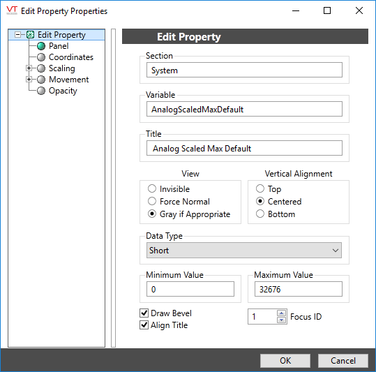
The properties dialog for the Edit Property Field widget:

Section
Application properties are organized by section. Properties that are placed in the wrong section will have no effect. The majority of properties that you are likely to use will be in the System section, but always confirm this before proceeding.
Variable
The name of the property that can be changed using this field.
Title
Should describe this edit property field to the operator.
View & Vertical Alignment
In most cases, properties that are not immediately available for editing will be shown as gray. You may override this to either make the field invisible, or to force the property to appear normal even though it cannot be changed.
Use the vertical alignment options to obtain the best appearance on a page.
Data Type
Restricts the values that the operator can provide. Must match the value type required by the configured variable.
Minimum and Maximum Values
If the data type is numeric, these restrict the range of values that the operator can provide.
If the data type is text, these restrict the number of characters that may be typed.
Bevel, Title and Focus ID
Use Bevel and Title to improve the appearance of the field.
You can disable a control widget by setting its Focus ID value to zero. The widget will remain visible, but faded.
Basic Components\Specialty\Settings Editing\
Tools\Standard Library\
