Border
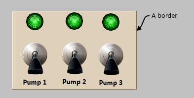
Borders are most often used to provide a visual indication to operators that a set of controls have some common purpose. Borders can appear raised or sunken relative to the rest of the page, and can be transparent or shaded.

You can find the Border image in the decorations folder of the Images palette.
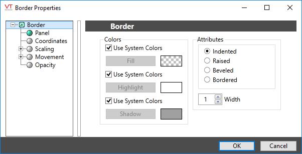
The properties dialog for a border:

Colors
By using the default option of System Colors, you can make your borders look similar dialog boxes used by your operating system.
The fill is the background color of the border's area. The highlight and shadow are used to make the border appear raised or sunken by simulating light shining on one edge or the other.
If you choose your own fill color, it is recommended that you use a darker shade of the same color for the shadow and a lighter shade of that color for the highlight.
Attributes and Width
Selection option for the visual effect that will be applied to the border. The difference is in the choice of the order of the shadow and highlight lines around the fill area.
Decorations
