Dynacard Display
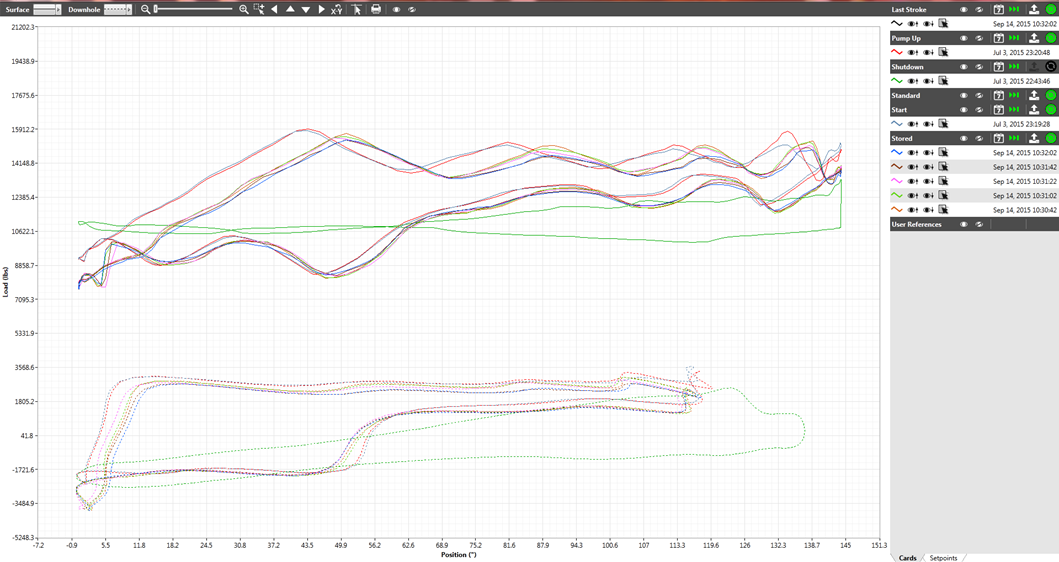
The Dynacard shows curves that model the load profiles of the pump-off controllers.

There are three principal components to this display:
- The graph is the central object on the display.
- The legend is located to the right of the graph. It allows filtering and selection of individual data sets.
- The toolbar is located above the graph.
Toolbar
The toolbar above the graph controls how the graph is displayed:

- The Surface drop list controls the type of line used to draw the surface pump profiles.
- The Downhole drop list controls the type of line used to draw the downhole pump profiles.
- Note that the width of the setpoint lines can be controlled using the DynacardSPLineWidth application property.
- The Increase Zoom Level and Decrease Zoom Level controls are two magnifying glass icons. The slider bar between them indicates the current zoom level but is not selectable itself. These can also be accessed with the + and - keys.
- Area Select Zoom allows the user to select a rectangular area on the graph to be zoomed in. This can also be accessed by pressing Ctrl-R.
- Pan Left, Pan Down, Pan Right, and Pan Up are used to move the graph along the x-axis and the y-axis. The arrow keys can also be used for this purpose.
- Reset Chart Pan and Zoom reverts the graph to the default position. This can also be accomplished by pressing the Esc key.
- Show Cursor Value will cause a small popup window to follow the mouse cursor on the graph, displaying the current coordinates of the pointer in scaled engineering units. Selecting Show Cursor Value again will make this popup window disappear. This can be toggled with Ctrl-T.
- Print opens a confirmation dialog asking if the page should be printed. If the user selects "OK", the page will be printed on the system's default printer. This functionality is also accessible via Ctrl-P.
- Hide All Graphs and Show All Graphs can be used to mask or display all data sets on the graph.
Legend
The legend section has three tabs, Cards, Timeline and Setpoints.
Cards

The legend shows a line entry for each card. The following tools are available:
- Hide All Cards’ Graphs and Show All Cards’ Graphs are used to mask or display all data sets for the corresponding cards.
- Select Data by Time opens a dialog for the user to pick which data sets to display.
- Enable Live Mode Data appears green when live data is being displayed for the card and red when historical data is being displayed. If historical data is currently being displayed, pressing this icon will switch to displaying live mode data.
- Upload Data from Device signals VTScada to poll the device for data.
- The circular polling indicator will rotate while the poll is active.
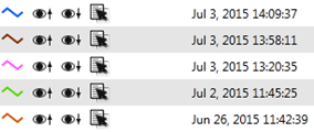
Several line entries appear beneath the title line of the card. These line entries correspond to data sets for that card. The following figure is an example of the data set for a card configured to display 5 data sets.

Key data available here includes
- The Legend Line displays the color used to depict this cycle on the graph.
- Toggle Surface Card Visibility causes the surface plot for this data set to hide or be shown.
- Toggle Downhole Card Visibility causes the downhole plot for this data set to hide or be shown.
- Save Card Data as Reference marks this data set record as a reference. It will appear as a data set under the "User References" card.
Timeline
The timeline section displays a single list of all downloaded cards within a specified time period. The user can toggle the display of each of these cards on the main Dynagraph plot.
Setpoints
The setpoints section displays all the setpoints that have been configured for this pump-off controller tag, both those that are visible as lines on the plot and those that are not. All setpoints can be changed from this screen.
Viewing Historical Data on the Dynacard
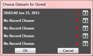
By default, the Dynacard displays the most recent data for a card. However, the user can manually select older data sets by pressing the “Select Data by Time” icon on the card's line item in the legend. Doing so will open the "Choose Datasets" window, as shown in the following figure:

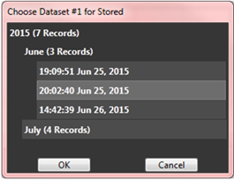
This window will display one or more lines, depending on the configuration of the corresponding Dynacard Input tag. Pressing the red "X" icon on a line will clear it so that it reads "No Record Chosen". If the user clicks on the calendar icon for a line, it will open a picker window:

Initially the window will display line items for years. Each item will indicate how many records occurred within that year. To select a timestamp, do the following:
- Click on a year. This will expand and display months at a slight indent. Each month will likewise indicate how many records occurred within it.
- Click on a month. The list will expand, displaying every data set within that month. If the user clicks on one of the timestamps, the selection will turn a light grey.
- Press the OK button. This will close the picker window.
- To select additional datasets, open another picker window and follow steps 1-3 above. Otherwise, press the OK button in the "Choose Datasets" window to save the selections. This will refresh the graph display with historical data. The Toggle Live Mode Data icon will turn red to indicate live data is not being dis-played for this card
